Table of Contents
ToggleDark paint colors have a reputation problem. Many homeowners avoid them, convinced they’ll make rooms feel cramped or cave-like. But here’s the reality: when used properly, dark hues create depth, sophistication, and a sense of luxury that lighter shades can’t match. Dark living room walls anchor furniture, hide imperfections, and provide a dramatic backdrop that actually makes spaces feel intentional rather than empty. Whether it’s a moody navy, sophisticated charcoal, or rich forest green, going dark isn’t about sacrificing light, it’s about controlling it.
Key Takeaways
- Dark paint colors create depth, sophistication, and intentional design in living rooms while providing practical benefits like hiding imperfections and making architectural details stand out.
- Navy blue, charcoal gray, and dark emerald or forest green are the best dark paint colors for living rooms in 2026, each offering different undertones to match your room’s lighting and furniture style.
- Evaluate your room’s fixed elements—especially flooring color and natural light exposure—before selecting a dark paint color, as cool-toned flooring pairs best with grays and cool navies while warm-toned flooring works better with forest greens.
- Proper preparation and technique are essential when painting dark colors: use a gray-tinted primer, high-quality brushes and rollers, and apply multiple thin coats rather than one thick coat to avoid visible marks and drips.
- Test dark paint samples directly on all four walls for at least three days to observe how the color shifts throughout morning, afternoon, and evening light before committing to your final choice.
Why Dark Paint Colors Work Beautifully in Living Rooms
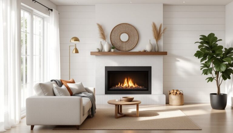
Dark paint delivers several practical advantages beyond aesthetics. First, these colors create visual weight and structure in large or awkwardly proportioned rooms. A 20-foot living room with builder-grade white walls can feel unfinished and echo-prone. Dark walls give the eye something to land on.
Second, dark hues are surprisingly forgiving. Minor wall damage, patched nail holes, and slight texture inconsistencies disappear against deep tones. Light colors, especially bright whites and pale grays, highlight every flaw and require near-perfect prep work.
Third, dark walls make trim, molding, and architectural details pop. Bright white baseboards and crown molding stand out sharply against charcoal or navy, creating contrast that adds dimension. The same trim against pale walls often disappears entirely.
Another overlooked benefit: dark colors work with both natural and artificial lighting. Morning sun streaming through windows creates dramatic shadows and depth. In evening hours, warm lamplight against dark walls produces a cozy, intimate atmosphere that lighter shades can’t replicate. The key is understanding that dark paint doesn’t absorb light, it reflects it differently, creating mood and visual interest.
One caveat: rooms with minimal natural light (north-facing windows, small windows, or heavy tree cover) require careful consideration. Test samples in your actual lighting conditions before committing to a full gallon. What looks sophisticated in a south-facing showroom might read flat in a dim space.
Best Dark Paint Colors for Living Rooms in 2026
Choosing a dark color involves more than pointing at a paint chip. Different undertones react differently to your room’s lighting, existing furniture, and architectural features.
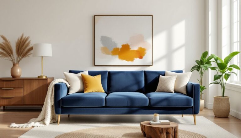
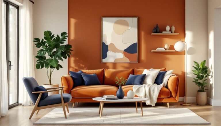
Navy Blue and Deep Indigo Shades
Navy blue remains the safest entry point into dark walls. It reads sophisticated without feeling gothic, works with both warm and cool accent colors, and pairs naturally with wood tones from light oak to dark walnut.
Look for navies with slight gray undertones rather than pure royal blues. These muted versions avoid the nautical theme trap while maintaining depth. In rooms with black living rooms inspiration, navy serves as a stepping stone before committing to true black.
Deep indigo leans slightly purple and works beautifully in rooms with warm lighting (Edison bulbs, warm LED at 2700K). The purple undertone brings warmth that prevents the cold feeling some homeowners fear with dark colors. Indigo pairs particularly well with brass fixtures, cognac leather furniture, and natural fiber rugs.
Application tip: Navy and indigo show roller marks and lap lines more than lighter colors. Use a high-quality roller cover (3/8-inch nap for smooth walls) and maintain a wet edge. Paint in sections, complete one wall before starting another.
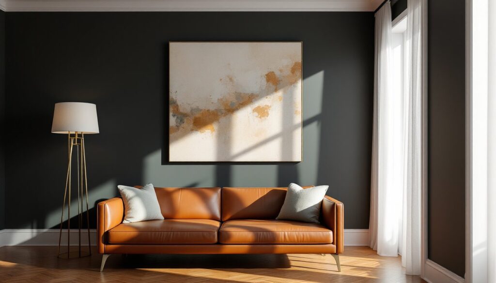
Charcoal Gray and Slate Tones
Charcoal gray has replaced greige as the neutral of choice for modern living rooms wanting drama without color commitment. True charcoal (not medium gray) provides the visual weight of black while reflecting slightly more light.
Test charcoal samples on all four walls. Some charcoals have blue undertones that read cold in north light but sophisticated in south or west-facing rooms. Others lean brown or purple. The undertone isn’t visible on the chip but becomes obvious at scale.
Slate tones fall between charcoal and navy, gray-blue hybrids that work well in contemporary spaces. They’re particularly effective in rooms with stainless steel, chrome, or brushed nickel fixtures. Slate creates a cohesive look when you want metal finishes to feel intentional rather than mismatched.
Trim consideration: Charcoal and slate need bright white trim (not cream or off-white) to create adequate contrast. If your existing trim is cream or antique white, either plan to repaint it or choose a warmer dark color like deep green or brown.
Rich Emerald and Forest Green
Dark greens deliver warmth and organic feel that grays and blues can’t match. Emerald green, deep, saturated, with slight blue undertones, works in both traditional and contemporary settings. It pairs naturally with wood furniture, plants, and natural textures.
Forest green leans darker and more olive. It’s the darkest “safe” choice for homeowners nervous about going too bold. Forest green reads almost neutral in low light but reveals depth and richness in daylight. This color particularly shines in rooms with warm wood floors (oak, hickory) or exposed beams.
Green’s advantage: it flatters skin tones in photos and creates a flattering backdrop for gatherings. Navy and charcoal can sometimes photograph flat or read as shadows. Green maintains visual interest on camera.
Both emerald and forest green benefit from diverse living room decor that incorporates natural materials. Pair with rattan, jute, linen, and unfinished wood to emphasize the organic connection. Metal accents in aged brass or oil-rubbed bronze work better than shiny chrome or nickel.
Finish note: Dark greens in matte or eggshell finish look more sophisticated than satin or semi-gloss, which can make the color appear shiny or artificial.
How to Choose the Right Dark Color for Your Living Room
Start by evaluating your room’s existing fixed elements, the ones you won’t change. Flooring color is the biggest factor. Cool-toned flooring (gray luxury vinyl plank, slate tile, light maple) pairs best with charcoal, slate, and cool navies. Warm-toned flooring (red oak, hickory, walnut, warm-toned carpet) works better with forest green, warm charcoal, or navy with brown undertones.
Next, consider your natural light exposure. South-facing rooms handle any dark color, abundant light prevents them from feeling oppressive. East-facing rooms get strong morning light but dim in afternoon: choose colors that look good in both conditions. West-facing rooms explode with warm afternoon sun, which can make cool grays appear slightly purple. North-facing rooms receive the least direct sun and require careful testing.
The sampling process matters. Buy 8-ounce sample jars of three to four colors. Paint 2-foot by 2-foot squares directly on your walls, not poster board. Paint chips and small samples don’t show how color shifts throughout the day. Live with samples for at least three days, observing them in morning, afternoon, and evening light plus under your artificial lighting.
Look at samples from different angles. Dark colors appear different when viewed straight-on versus at an angle. Sit on your couch and look at the wall where you’ll actually spend time. The color that looks best from your typical viewing angle wins.
Consider your furniture style and what stylish living rooms you’ve admired. Mid-century modern furniture (tapered legs, clean lines) works with any dark color. Traditional furniture (rolled arms, skirted sofas) pairs best with navy or forest green. Industrial style (metal frames, exposed hardware) demands charcoal or slate. Your existing furniture investment should influence your wall color, not the other way around.
Finally, think about adjacent rooms. If your living room flows into a dining room or kitchen, the colors need to work together. Dark living room walls look intentional when paired with neutral living rooms in connecting spaces, creating purposeful contrast rather than jarring transitions.
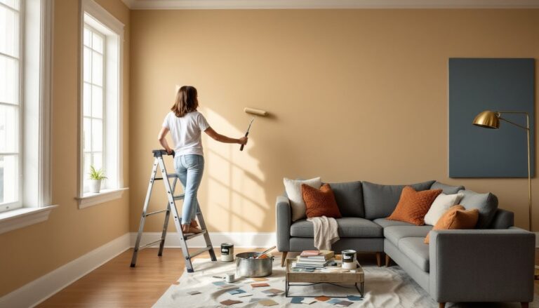
Painting Tips and Techniques for Dark Living Room Walls
Dark paint requires better prep and technique than light colors. Every shortcut shows.
Surface prep is non-negotiable. Fill nail holes with lightweight spackling compound, let dry completely (usually 2-4 hours), then sand smooth with 150-grit sandpaper. Dark colors won’t hide damage. Wipe walls with a damp cloth to remove dust before priming.
Prime everything. Even if painting over existing paint, use a gray-tinted primer rather than white. Gray primer reduces the number of finish coats needed and prevents the base color from affecting your final result. One gallon of primer covers approximately 350-400 square feet. Don’t skimp, coverage on dark colors depends on proper primer application.
Choose the right finish. Matte hides wall imperfections best and looks most sophisticated but shows scuffs in high-traffic areas. Eggshell (low sheen) provides slight cleanability while maintaining a subtle look. Avoid satin or semi-gloss unless you have perfectly smooth walls, sheen amplifies texture and imperfections.
Painting technique matters more with dark colors. Use a high-quality angled brush (2.5-inch width) for cutting in along trim and corners. Cheap brushes leave visible stroke marks. For rolling, a premium 3/8-inch nap roller cover creates smooth application without stipple texture.
Apply thin, even coats rather than trying to cover in one pass. Two or three thin coats look better than one thick coat. Thick application causes drips, sags, and uneven sheen. Plan for at least two finish coats over primer, possibly three for optimal depth and even color.
Maintain a wet edge while rolling. Work in 3-foot sections, overlapping slightly with previous sections before the paint dries. Once dark paint dries, going back over it creates lap marks that remain visible forever.
Protect trim with blue painter’s tape (not cheap masking tape). Press edges firmly to prevent paint bleed. Remove tape while paint is still slightly damp, waiting until it’s fully dry can pull paint off the wall.
Ventilation and safety: Dark paints often have higher pigment loads. Wear a dust mask during sanding and ensure good ventilation during painting. Open windows and use fans. Most modern paints are low-VOC, but proper airflow still matters.
Expect coverage of 350-400 square feet per gallon for finish coats. A typical 12×15-foot living room with 8-foot ceilings has roughly 432 square feet of wall space (excluding windows and doors). Plan for two gallons of finish paint plus one gallon of primer.
One final tip gleaned from paint tutorials: plan your painting order. Paint ceiling first (if changing ceiling color), then walls, then trim. If keeping ceiling white, use careful cutting-in technique or tape the ceiling-wall joint. Dark paint on white ceilings requires serious touch-up work.
Dark colors also work well in living rooms highlighted by interior design inspiration sites, where strategic lighting and thoughtful furniture placement turn bold paint choices into sophisticated statements rather than design risks.