Table of Contents
ToggleBurnt orange has made a powerful comeback in 2026, and for good reason. This rich, earthy hue brings warmth without the heaviness of traditional reds, and it pairs surprisingly well with both modern and traditional design styles. Whether someone’s tackling a full room makeover or just looking to refresh tired décor, burnt orange offers flexibility that few colors can match. It works as a bold statement wall, a subtle accent through textiles, or even as a primary furniture color. This guide walks through practical ways to incorporate burnt orange into a living room, from choosing the right shade to coordinating complementary colors and accessories.
Key Takeaways
- Burnt orange living room ideas work across modern, traditional, and mid-century design styles, making it a versatile color choice that encourages conversation and creates inviting atmospheres.
- Select burnt orange shades based on your room’s lighting direction: deeper tones with red undertones for north-facing rooms, and cooler burnt oranges with brown undertones for sun-filled south-facing spaces.
- An accent wall behind the main seating area is the safest way to introduce burnt orange, requiring thorough surface prep, a gray-tinted primer, and at least two coats for even coverage.
- Pair burnt orange furniture or accents with complementary colors like navy, cream, forest green, or charcoal gray, and follow the 60-30-10 rule to keep the color balanced and avoid overwhelming the space.
- Start small with burnt orange accessories like throw pillows, blankets, and area rugs, then layer in additional pieces like artwork or lamps once you’re confident the color works in your living room.
Why Burnt Orange Is the Perfect Living Room Color Choice
Burnt orange sits in a unique position on the color spectrum, warm enough to create coziness but sophisticated enough to avoid feeling dated or kitschy. Unlike bright tangerine or safety orange, burnt orange contains brown undertones that ground it and make it easier to live with long-term.
From a design perspective, this color works across multiple styles. In mid-century modern spaces, it echoes the palette of the 1960s and ’70s without feeling retro. In contemporary rooms, it provides an unexpected pop that breaks up the monotony of gray and white. Even in traditional settings, burnt orange can replace burgundy or rust for a fresher take on classic warmth.
The psychological impact matters too. Warm colors like burnt orange have been shown to encourage conversation and create inviting atmospheres, ideal for a space designed for gathering. It’s energizing without being overstimulating, which makes it particularly effective in living rooms where people spend extended periods.
One practical advantage: burnt orange hides wear better than lighter colors. In high-traffic living rooms, upholstery and paint in this shade won’t show every scuff or stain the way cream or pale blue might.
Choosing the Right Shade of Burnt Orange for Your Space
Not all burnt oranges are created equal. The shade that works depends on lighting, room size, and existing finishes.
In rooms with abundant natural light, particularly north-facing windows that bring in cooler light, deeper burnt orange shades with more red undertones warm the space effectively. Think terracotta leaning toward brick red. In south-facing rooms with warm, direct sunlight, cooler burnt oranges with slight brown or even gray undertones prevent the space from feeling too hot.
Room size influences shade selection too. Darker, richer burnt oranges can make small living rooms feel intimate rather than cramped, especially when balanced with lighter furnishings. Larger rooms can handle both deep and lighter burnt orange tones, but going too pale risks the color reading as peachy rather than sophisticated.
Test paint samples on multiple walls before committing. Paint a 2×2-foot section on at least two different walls and observe how the color shifts throughout the day. Morning light, afternoon sun, and evening artificial lighting will all change how the shade appears.
Existing finishes matter. If the living room has warm-toned oak or pine flooring, choose burnt orange with similar warm undertones. With cool-toned gray or white oak, consider burnt orange that leans slightly toward rust or brown to create contrast without clashing. When working with modern paint colors, burnt orange often bridges warm and cool palettes effectively.
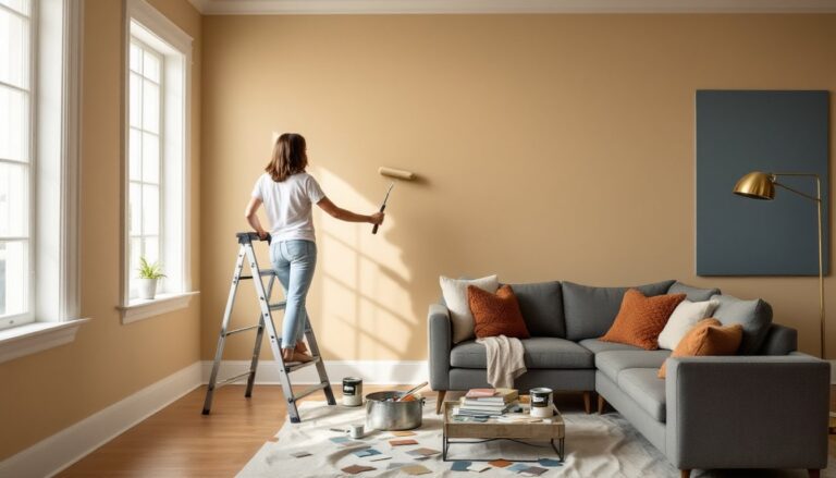
Burnt Orange Accent Walls and Paint Techniques
An accent wall is the most common way to introduce burnt orange without overwhelming the space. The key is choosing the right wall and executing proper surface prep.
Wall Selection: The wall behind the main seating area or the one opposite the room’s entrance typically works best. Avoid walls with multiple windows or doors, the broken surface area dilutes the impact. In open-plan living areas, an accent wall helps define the living zone without physical barriers.
Surface Preparation: Clean walls thoroughly with TSP (trisodium phosphate) cleaner to remove oils and residue. Fill nail holes and imperfections with lightweight spackling compound, then sand smooth with 120-grit sandpaper once dry. Prime with a gray-tinted primer if covering darker existing paint: it provides better color accuracy than white primer under deep oranges.
Paint Application: Use a ½-inch nap roller for smooth walls, ¾-inch for textured surfaces. Two coats minimum, burnt orange pigments can appear streaky with single coats. Cut in (edging) with a 2-inch angled brush before rolling each coat.
Beyond solid color, consider these techniques:
- Color blocking: Pair burnt orange with a complementary neutral, dividing the wall horizontally at chair rail height (typically 32-36 inches from the floor).
- Ombré effect: Graduate from burnt orange at the bottom to cream at the ceiling. This requires blending wet paint and works best with a helper.
- Textured application: Use a trowel or wide putty knife to apply joint compound in sweeping patterns before painting for a subtle dimensional effect.
One gallon of quality paint typically covers 350-400 square feet with one coat. For a standard 12×15-foot living room accent wall, one gallon should suffice for two coats.
Furniture and Upholstery in Burnt Orange Tones
Burnt orange furniture makes a statement, but it requires strategic placement and fabric selection to avoid overwhelming the room.
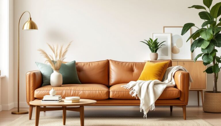
Sofas and Sectionals: A burnt orange sofa works best as the sole large-scale colorful piece in the room. Balance it with neutral walls (warm white, greige, or soft gray) and neutral area rugs. Velvet upholstery in burnt orange reads more formal and catches light beautifully, while linen or cotton blends feel casual and family-friendly. Velvet also hides minor wear better than smooth fabrics.
For families concerned about maintenance, choose performance fabrics with stain-resistant treatments. Many manufacturers now offer velvet-look polyester blends that clean easier than natural fibers.
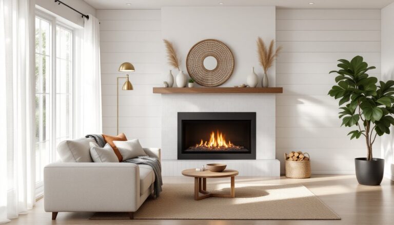
Accent Chairs: A single burnt orange accent chair provides color without commitment. Place it at an angle in a conversation grouping or flanking a fireplace. Mid-century modern chair designs, think tapered wooden legs and clean-lined cushions, particularly suit this color.
Ottomans and Poufs: These offer the easiest entry point for burnt orange upholstery. They’re small enough to reposition or swap out seasonally, and they provide flexible additional seating.
Durability Considerations: Check upholstery ratings. For living rooms with kids or pets, look for fabrics rated at least 30,000 double rubs (Wyzenbeek test) or 40,000 cycles (Martindale test). These indicate how many times fabric can be rubbed before showing wear.
When combining burnt orange furniture with stylish living room layouts, ensure sight lines remain clear and the color doesn’t create awkward focal point competition with architectural features.
Complementary Color Palettes That Enhance Burnt Orange
Burnt orange plays well with a surprising range of colors, but some combinations work better than others for living rooms.
Classic Pairings:
- Cream and burnt orange: This combination feels warm and approachable. Use cream as the dominant color (walls, larger furniture) with burnt orange as accents.
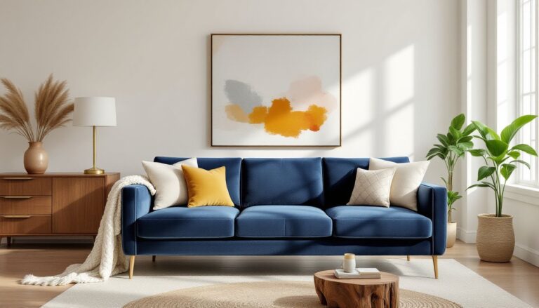
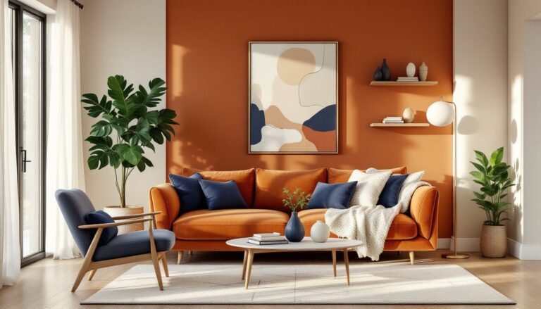
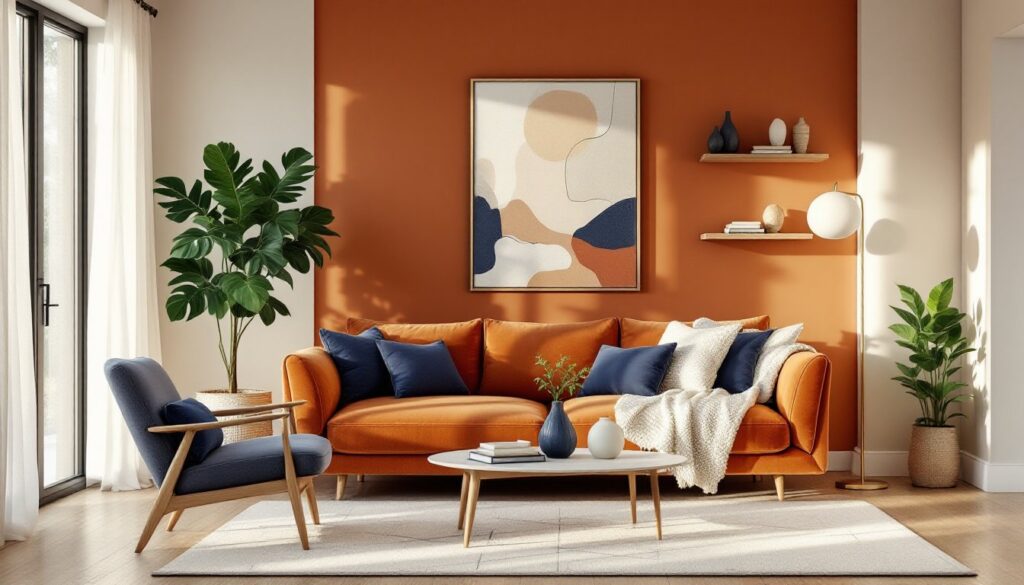
- Navy and burnt orange: High contrast that feels both traditional and contemporary. Navy grounds the warmth of orange, preventing it from feeling too casual. This pairing works especially well in modern living room designs where clean lines benefit from bold color contrast.
- Forest green and burnt orange: Earthy and organic, this combination brings outdoor color palettes inside. Use forest green in smaller doses, throw pillows, plant pots, or artwork.
Unexpected Combinations:
- Burnt orange and teal: These sit opposite on the color wheel, creating vibrant contrast. Keep one color dominant: equal amounts compete for attention.
- Burnt orange and charcoal gray: More sophisticated than burnt orange with black, charcoal provides depth without harshness. Interior designers frequently feature this combination on platforms like Homedit for its versatility.
- Burnt orange and blush pink: Softer and more feminine, this works particularly well in living rooms with vintage or eclectic styling.
Metallic Accents: Brass and copper metallics amplify burnt orange’s warmth, while brushed nickel and chrome provide cooling contrast. In mixed-metal schemes, keep hardware and lighting fixture finishes consistent within each material type, all brass or all nickel, to maintain cohesion.
Proportion Matters: Follow the 60-30-10 rule: 60% dominant color (usually walls/large furniture), 30% secondary color, and 10% accent color. If burnt orange is the accent, it should appear in roughly 10% of visible surfaces for balanced impact.
Accessories and Decor to Complete Your Burnt Orange Living Room
Accessories offer the lowest-risk way to test burnt orange or layer it into existing schemes.
Textiles:
- Throw pillows: Mix solid burnt orange with patterned options that incorporate the color. Standard 18×18-inch or 20×20-inch pillow covers work on most sofas. Use odd numbers (three or five) for visual interest.
- Throw blankets: Chunky knit or woven textures in burnt orange add warmth and tactile interest. Drape over sofa arms or the back of chairs.
- Curtains: Burnt orange curtains frame windows dramatically but can overwhelm if used on multiple large windows in one room. Consider this approach only if walls and furniture remain neutral. For wide windows, two panels per window at 1.5 to 2 times the window width when gathered creates proper fullness.
Artwork and Wall Decor: Abstract art incorporating burnt orange alongside neutrals ties the color scheme together without literal representation. Frame sizes should relate to furniture scale, artwork above a sofa should span two-thirds to three-quarters of the sofa width.
Rugs: A burnt orange area rug anchors seating arrangements and defines the living zone in open-plan spaces. For proper proportion, the rug should extend at least 6-12 inches beyond all sides of the furniture grouping, or all front furniture legs should rest on the rug.
Decorative Objects:
- Vases and bowls: Ceramic or glass pieces in burnt orange provide color on coffee tables, shelves, and mantels.
- Lamps: Burnt orange lamp shades cast warm ambient light. Pair with 2700K-3000K warm white LED bulbs for cohesive lighting temperature.
- Books: Yes, books count as decor. Collect books with burnt orange spines or covers for styled shelving. Stack horizontally with decorative objects on top.
Greenery: Live plants provide natural contrast to burnt orange. Deep green foliage, like fiddle leaf figs, snake plants, or pothos, complements the warmth without clashing. Terracotta pots reinforce the earthy palette, a trend highlighted in recent interior design features.
Seasonal Rotation: Swap out lighter-weight burnt orange accessories in summer for linen textures, and bring in heavier velvet or wool textures in fall and winter. This keeps the color feeling intentional rather than stagnant.
Conclusion
Burnt orange brings warmth, personality, and surprising versatility to living rooms. Whether someone commits to a painted accent wall, invests in upholstered furniture, or starts small with accessories, this color works across design styles and home types. The key is balancing it with complementary neutrals and metallics, choosing the right undertones for existing lighting, and not overdoing it. Start with one or two burnt orange elements, live with them for a few weeks, then layer in additional pieces as confidence grows.