
Table of Contents
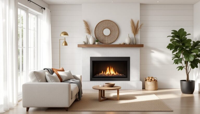
ToggleChoosing the right paint color can make or break a living room. Too dark, and the space feels cramped. Too light, and it might come off sterile. Behr offers hundreds of shades, from subtle neutrals to bold statement colors, with formulations designed to cover well and hold up to daily wear. Whether refreshing a dated space or finishing new drywall, the right color sets the tone for how a room feels and functions. This guide breaks down the best Behr paint colors for living rooms in 2026, covering warm neutrals, cool tones, and accent wall options, with practical tips on how to test and choose.
Key Takeaways
- The right Behr paint color for your living room depends on natural light, fixed elements like flooring and trim, and the room’s orientation—north-facing rooms need testing to avoid icy cool tones or muted warm colors.
- Behr paint colors range from warm neutrals like Swiss Coffee and Wheat Bread to cool tones like Silver Drop and Ocean Abyss, with each product line (Marquee, Premium Plus, Dynasty) offering different coverage and durability for your project needs.
- Always test paint samples on at least two walls for 48 hours, observing them at different times of day and under varied lighting conditions, as colors shift dramatically between the paint chip and your wall.
- Bold accent wall colors like In the Moment (red), Midnight Blue, and Burnished Clay add personality without full commitment, but require proper prep, two coats, and strategic lighting to avoid a cave-like effect.
- Behr’s paint-and-primer formulas reduce prep time, but surface preparation remains critical—dirty or glossy walls need cleaning and sanding for proper adhesion, even with premium paints.
Why Behr Remains a Top Choice for Living Room Transformations
Behr holds shelf space at Home Depot stores nationwide, making it accessible for most DIYers without ordering online or visiting specialty paint retailers. The brand offers multiple product lines, Behr Premium Plus, Marquee, Dynasty, and Ultra, each with different coverage, durability, and sheen options.
Marquee is the top-tier line, offering one-coat coverage in many colors and built-in primer. It’s a solid pick for covering dark walls or going from a bold color to a lighter shade without multiple coats. Premium Plus is the workhorse, good hide, decent durability, and budget-friendly for larger spaces. Dynasty sits in the middle, with added stain resistance and scrubbability, useful in high-traffic living rooms with kids or pets.
Behr also publishes annual color trends and maintains a robust online tool for visualizing colors in different lighting conditions. Their paint-and-primer formulas reduce prep time, though surface preparation still matters, dirty or glossy walls need cleaning and light sanding for proper adhesion, even with premium paints. Coverage typically runs 350-400 square feet per gallon, but textured walls or porous surfaces may require more. Always buy extra for touch-ups: custom tints can vary slightly between batches.
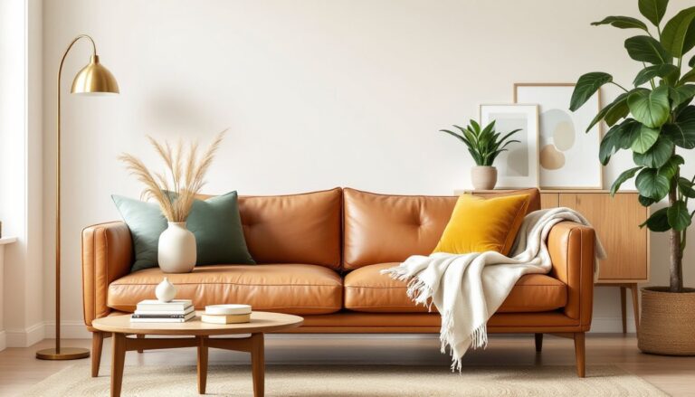
Warm Neutrals That Create Inviting Living Spaces
Warm neutrals anchor a room without competing with furniture or décor. They work in traditional and contemporary spaces, adapting to natural and artificial light.
Behr Swiss Coffee (N210-1) is a classic warm white with subtle yellow undertones. It reads clean without the stark coldness of pure white, making it ideal for living rooms with lots of natural light. Pair it with white trim in Ultra Pure White for contrast, or use it throughout for a seamless look.
Behr Wheat Bread (N290-3) is a soft beige that leans slightly tan. It’s warmer than greige but not as yellow as traditional beige, fitting well in spaces with oak or maple flooring. This shade works in living rooms that need a cozy, grounded feel without going dark.
Behr Sculptor Clay (MQ2-46) brings in terracotta warmth without the intensity of orange. It’s a mid-tone neutral that pairs well with natural wood, woven textures, and earthy accents. Use it as an all-over color or on a single wall to define a conversation area.
For deeper warmth, Behr Harvest Brown (N210-7) serves as an accent color on one wall or in alcoves. It’s rich without being oppressive, especially when balanced with lighter tones on adjacent walls. Many modern trends in warm neutrals emphasize layering shades within the same color family for depth.
Warm neutrals tend to shift in different lighting. North-facing rooms may pull out cooler undertones, while south-facing spaces amplify warmth. Test samples on multiple walls before committing.
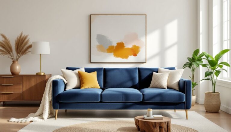
Cool and Calming Tones for Modern Living Rooms
Cool tones create a sense of calm and openness, working well in contemporary spaces with clean lines and minimal clutter. They reflect light effectively, making smaller living rooms feel more spacious.
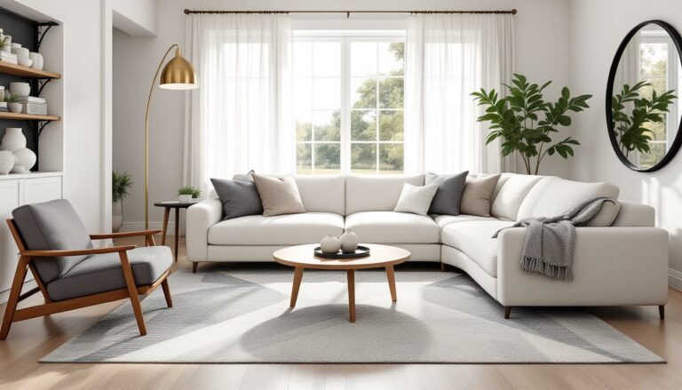
Behr Silver Drop (N500-3) is a soft gray with subtle blue undertones. It reads neutral in most lighting but picks up coolness in north-facing rooms. Pair it with crisp white trim and black accents for a modern, high-contrast look. This shade works in modern living rooms that lean toward Scandinavian or minimalist design.
Behr Light French Gray (N510-2) is lighter and slightly warmer than Silver Drop, bridging the gap between gray and greige. It’s versatile enough to work with both warm wood tones and cooler metallics, making it a safe pick if the décor plan isn’t fully locked in.
Behr Ocean Abyss (S470-5) is a mid-tone blue-gray that adds personality without overwhelming the space. It’s deeper than typical gray but not as saturated as navy, fitting well as an all-over color in living rooms with ample natural light. This shade pairs well with white wainscoting or trim to break up the color and add architectural interest.
For a true blue, Behr Blueprint (S470-4) offers a muted, dusty tone that avoids the starkness of primary blue. It’s a strong choice for accent walls or spaces where a bit of color is wanted without going bold. Interior designers often recommend versatile cool tones for their adaptability across changing décor styles.
Cool tones can feel sterile if the room lacks warmth from textiles, wood, or layered lighting. Balance them with warm-toned furniture, area rugs, and throw pillows to keep the space inviting.
Bold Accent Wall Colors to Add Drama and Personality
An accent wall is a lower-commitment way to introduce bold color without painting the entire room. It works best on the wall that draws the eye first, often the one behind the sofa or the wall with a fireplace.
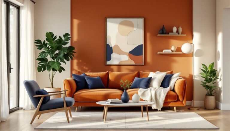
Behr In the Moment (S110-7) is a deep, saturated red with warm undertones. It’s bold without leaning orange, making it a strong choice for accent walls in living rooms with neutral furniture. This color demands good lighting: pair it with recessed lights or sconces to avoid a cave-like effect.
Behr Midnight Blue (S500-7) is a near-black navy that adds depth and sophistication. It works well in living rooms with high ceilings or abundant natural light, where the darkness won’t shrink the space. Use it on a single wall and keep adjacent walls light to maintain balance. Bold, dramatic living room colors are gaining traction in contemporary design.
Behr Back to Black (MQ2-4) is a true black with minimal undertones. It’s high-risk but high-reward, ideal for modern spaces with lots of white trim, large windows, and strategic lighting. Black reads flat in low light, so use a satin or eggshell sheen to add dimension and reflectivity.
For something less intense, Behr Burnished Clay (S210-7) is a deep rust-orange that brings warmth and energy. It works in eclectic or bohemian-style living rooms, pairing well with natural fiber rugs, brass fixtures, and vintage furniture.
Bold colors show imperfections more than neutrals. Patch nail holes, sand rough spots, and prime the wall with a tinted primer close to the final color for even coverage. Two coats are usually necessary for saturated tones, even with premium paint.
How to Choose the Right Behr Color for Your Living Room
Picking a paint color isn’t just about what looks good on a chip. Lighting, existing furniture, flooring, and the room’s orientation all affect how a color reads in real life.
Start by assessing the room’s natural light. North-facing rooms receive cooler, indirect light, which can make warm colors look muted and cool colors feel icy. South-facing rooms get warm, direct sunlight, which intensifies warm tones and can wash out cool ones. East- and west-facing rooms shift throughout the day, cooler in the morning (east) or evening (west), warmer at other times.
Consider the room’s fixed elements: flooring, trim, built-ins, and large furniture pieces that won’t be replaced. A living room with honey oak flooring may clash with cool grays but harmonize with warm neutrals or earthy tones. White or off-white trim provides a clean break between wall color and architectural details, while wood trim works better with colors that complement the wood’s undertones.
Think about the room’s function and the mood desired. Living rooms used primarily in the evening benefit from warmer tones that feel cozy under lamplight. Spaces used during the day can handle cooler tones that reflect natural light and feel airy. High-traffic living rooms with kids or pets should use washable finishes like eggshell or satin, which handle scrubbing better than flat paint.
Many homeowners overlook the ceiling. A white ceiling reflects light and makes the room feel taller, but painting it the same color as the walls (or a lighter tint of the wall color) creates a cohesive, enveloping effect. This works best in rooms with high ceilings or abundant light. For ideas on balancing color with other design elements, explore stylish living room approaches that integrate paint with furnishings and lighting.
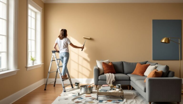
Testing Paint Samples Before You Commit
Paint samples are non-negotiable. Colors shift dramatically between the store, the chip, and the wall.
Buy 8-ounce sample jars of the top three to five colors. Apply two coats to a 2-foot by 2-foot section on at least two different walls, one that gets direct light and one that doesn’t. Use a piece of white poster board or foam core if painting directly on the wall isn’t an option: this also allows moving the sample around the room.
Observe the samples at different times of day: morning, midday, late afternoon, and evening under artificial light. Colors that look perfect at noon may turn muddy or garish under warm LED bulbs at night. If the living room has a mix of lighting, overhead recessed lights, table lamps, floor lamps, turn them all on and evaluate.
Live with the samples for at least 48 hours before deciding. Snap photos with a smartphone: the camera often picks up undertones the eye overlooks. If a color feels off, eliminate it and test another.
Paint finishes also affect color perception. Flat absorbs light and hides imperfections but is harder to clean. Eggshell has a slight sheen, easier to wipe down, and works well on living room walls. Satin is more durable and washable, suitable for high-traffic areas. Semi-gloss is generally reserved for trim, doors, and built-ins. Many DIY guides on platforms like Addicted 2 Decorating walk through sample testing and finish selection in detail.
Conclusion
The right Behr paint color transforms a living room from functional to finished. Warm neutrals offer flexibility and timeless appeal, cool tones bring calm and modernity, and bold accent walls inject personality without long-term commitment. Testing samples in real conditions, understanding how light affects color, and matching paint to the room’s fixed elements are the keys to avoiding costly repaints. Take the time to prep surfaces properly, choose the right finish, and don’t skip the second coat.