Table of Contents
ToggleBlack and red might sound intimidating to some homeowners, but this classic pairing delivers drama, sophistication, and visual impact that few color schemes can match. Done right, a black and red living room becomes a confident statement of style, not a college dorm room or a Halloween display. The key lies in balancing proportions, choosing the right materials, and anchoring the palette with intentional design choices. Whether leaning modern, traditional, or somewhere eclectic, these 15 design ideas offer practical starting points for transforming a living space into something memorable.
Key Takeaways
- A balanced black and red living room uses a 60% black, 30% red, and 10% neutral accent ratio to create sophistication without overwhelming the space.
- Black and red create visual contrast that makes both colors more vibrant together, with black grounding the eye while red adds warmth and energy.
- Layer three levels of lighting—ambient, task, and accent—with warm-toned bulbs (2700K-3000K) to prevent dark colors from making the room feel flat or dim.
- Start with one bold anchor piece like a red sofa or black accent wall, then build your black and red living room with textiles, metallics, and natural materials to add depth and comfort.
- Both black and red hide wear and staining exceptionally well, making this palette practical for households with kids, pets, or high-traffic living spaces.
- Incorporate varied textile textures—leather, velvet, linen, and knit—in your throw pillows and area rugs to soften the intensity of bold colors and create visual interest.
Why Black and Red Work Together in Living Room Design
Black and red sit on opposite ends of the intensity spectrum, but that tension is exactly why they work. Red commands attention, it’s energizing, warm, and emotionally charged. Black provides the visual weight and grounding that keeps red from overwhelming the space. Together, they create contrast without chaos.
From a design theory standpoint, the pairing is rooted in value contrast. Black anchors the eye and defines boundaries, while red adds warmth and directionality. This contrast makes both colors appear more vibrant than they would alone. The effect is confident and deliberate, not accidental.
Historically, black and red have appeared in everything from Art Deco interiors to traditional Asian design, proof that the combination adapts to multiple styles. In 2026, this palette is trending again, especially in spaces that reject the overly neutral minimalism of the past decade. Homeowners want personality, and black-and-red schemes deliver it without requiring a full gut renovation.
One practical advantage: both colors hide wear well. Dark upholstery resists visible staining, and red tones mask minor imperfections in paint or fabric better than lighter hues. For households with kids, pets, or frequent guests, that’s a real-world benefit worth considering.
Balancing Drama and Sophistication with Your Color Palette
The proportion of black to red determines whether a room feels moody and intimate or bold and theatrical. A common starting ratio is 60% black, 30% red, and 10% neutral or metallic accents. This keeps the space grounded without feeling oppressive.
For a more dramatic look, reverse the ratio: 60% red on walls or large furniture pieces, with black as the grounding accent in trim, shelving, or structural elements. This approach works best in rooms with ample natural light, southern or western exposures, since red absorbs less light than black and keeps the space from feeling cave-like.
Neutrals play a crucial supporting role. Crisp white trim, soft gray textiles, or natural wood tones prevent the palette from becoming one-note. Metallics, brushed nickel, matte black hardware, or warm brass, add dimension without competing for attention. According to recent interior design trends, incorporating tactile materials like leather, linen, and matte-finish metals helps break up the intensity of a bold color scheme.
Avoid adding too many additional accent colors. Teal, mustard, or purple might seem like good ideas on a mood board, but they dilute the impact of the primary palette. Stick to variations within the black-red-neutral range: charcoal, burgundy, cream, or taupe. If a pop of contrast is needed, a single metallic or a warm wood tone does the job more effectively.
Furniture Selection for Black and Red Living Rooms
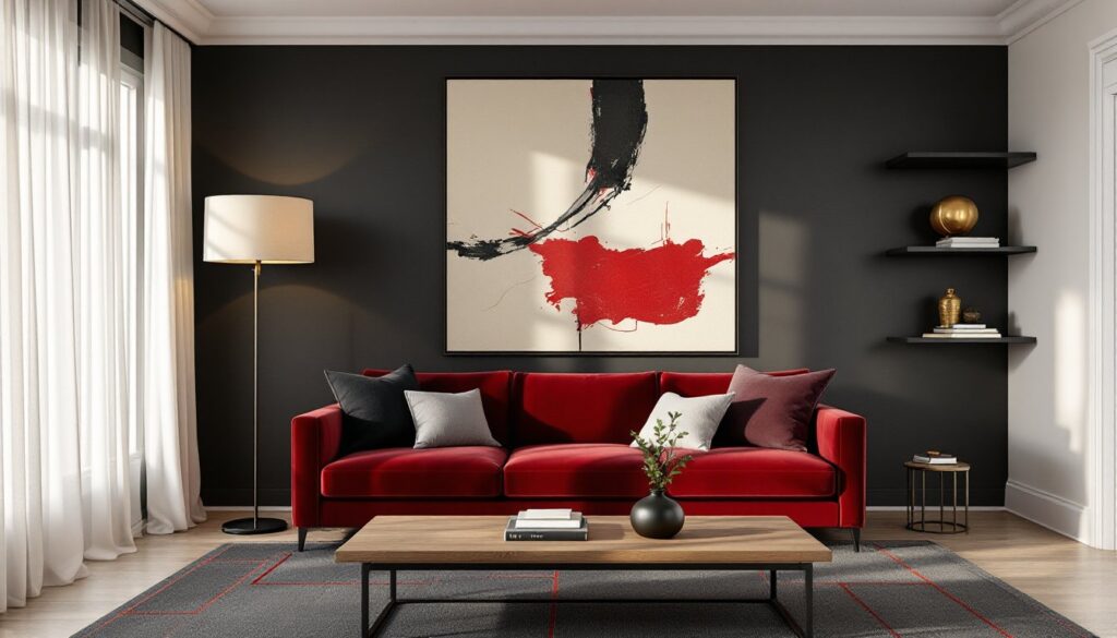
Start with the largest pieces first: the sofa and primary seating. A black leather sectional or a deep red velvet sofa sets the tone and anchors the room. Leather ages well and handles wear, making it practical for high-traffic living rooms. Velvet, while more delicate, adds a tactile richness that elevates the entire space.
If committing to a red or black sofa feels too bold, choose a neutral base, charcoal, gray, or even a dark taupe, and layer in color through accent chairs, ottomans, or throw pillows. A pair of red armchairs flanking a black console table creates symmetry and visual interest without overwhelming the layout.
Coffee tables and side tables should contrast the upholstery. A black metal frame coffee table with a glass or wood top pairs well with red seating, while a natural walnut or oak table softens an all-black sofa set. Avoid matchy-matchy furniture sets: mixing materials, metal, wood, glass, adds depth.
Many designers now embrace modern living room aesthetics that combine streamlined furniture with bold color, making this palette more accessible than ever. Storage furniture like bookshelves or media consoles work best in black or dark wood finishes. These pieces recede visually, letting the bolder elements take center stage. If the room lacks built-ins, a black shelving unit with red-spined books, decor objects, or framed art reinforces the color story without additional effort.
Wall Treatments and Accent Strategies
Paint is the most direct way to introduce black or red, but it’s also the most permanent. For a first-time experiment with this palette, start with a single accent wall in a deep red, Benjamin Moore’s Caliente or Sherwin-Williams’ Red Bay are popular choices. Pair it with three neutral or black walls to test the impact before committing further.
All-black walls create instant drama, but they demand strong lighting and enough square footage to avoid a cramped feel. In smaller living rooms (under 200 square feet), black works better as wainscoting, trim, or ceiling paint rather than full-wall coverage. According to modern paint color strategies, using darker hues on ceilings or lower wall sections can add depth without shrinking perceived space.
Wallpaper offers pattern and texture that solid paint can’t. A black-and-red geometric print, a subtle damask, or even a bold floral in these tones adds complexity. For renters or commitment-phobes, peel-and-stick options from brands like Tempaper or Chasing Paper allow experimentation without long-term consequences. One accent wall in wallpaper, with the rest painted matte black or charcoal, strikes a balance.
Molding and trim color matters. White or cream trim against black walls creates sharp contrast: black trim against red walls blends the palette more seamlessly. Choose based on whether the goal is high contrast or tonal cohesion. If the room has existing wood trim, staining it espresso or ebony instead of painting maintains architectural character while supporting the palette.
Textiles, Accessories, and Finishing Touches
Textiles soften the hard edges of a bold color scheme and add layers of comfort. Start with throw pillows in varied textures: a mix of red linen, black velvet, and a neutral herringbone or cable knit. Aim for pillows in at least three different fabrics to avoid a flat, one-dimensional look. Standard sizing is 18×18-inch or 20×20-inch for most sofas.
Area rugs ground the seating area and tie the palette together. A black rug with a subtle red pattern, or a red rug with black geometric details, reinforces the color story underfoot. Wool or polypropylene rugs handle traffic better than natural fiber options like jute, which can show wear quickly. For sizing, the rug should extend at least 12 inches beyond the front legs of the sofa and chairs.
Curtains and window treatments control light and add verticality. Floor-to-ceiling red curtains in a medium-weight linen create warmth and drama, especially when paired with black curtain rods. Blackout lining is worth adding if the room doubles as a media or entertainment space. For a subtler approach, black curtains with red tiebacks or trim maintain the palette without dominating the windows.
Accessories, art, vases, books, candles, complete the look. Framed black-and-white photography pops against red walls: abstract art with red and black brushstrokes reinforces the theme on neutral walls. Designing a cohesive living room inspiration board before purchasing accessories helps avoid impulse buys that don’t serve the overall vision. Metallic accents in matte black or brass tie the scheme together. Limit tchotchkes, this palette is strong enough that less is more.
Lighting Tips to Enhance Your Black and Red Scheme
Dark colors absorb light, so a black-and-red living room demands a thoughtful lighting plan. Relying solely on overhead fixtures will leave the space feeling flat or dim. Layer lighting across three levels: ambient, task, and accent.
Start with ambient lighting: recessed LED cans or a central ceiling fixture provide general illumination. Choose bulbs in the 2700K to 3000K range (warm white) to complement red tones and soften black surfaces. Cool-toned bulbs (above 4000K) will make reds look muddy and blacks feel harsh.
Task lighting includes floor lamps beside seating areas and table lamps on side tables or consoles. Black metal or matte black lamp bases reinforce the palette, while linen or fabric shades in cream or gray diffuse light evenly. Adjustable reading lamps, swing-arm or arc styles, add function without cluttering surfaces.
Accent lighting highlights architectural features, artwork, or texture. Picture lights above framed art, LED strip lighting inside shelving, or uplights in corners add drama and depth. Smart bulbs or dimmer switches allow control over intensity, crucial for a palette this bold. Many homeowners exploring stylish living room setups find that adjustable lighting transforms the mood of the space throughout the day.
Natural light is the best light. Avoid heavy, dark window treatments if the room has good sun exposure. Sheer panels under blackout curtains give flexibility, open during the day, closed at night or for movie watching. Mirrors opposite windows reflect light and visually expand the space, a particularly useful trick in smaller living rooms.
Conclusion
A black and red living room isn’t for the timid, but it’s also not as risky as it sounds. With deliberate proportions, quality materials, and layered lighting, this bold palette becomes sophisticated rather than overwhelming. Start with one or two anchor pieces, a red sofa, black accent wall, or patterned rug, and build from there. The result is a space with personality, confidence, and staying power that trends can’t touch.