Table of Contents
ToggleBrown and beige living rooms don’t get enough credit. While everyone’s chasing the latest color trend, these earth tones quietly deliver warmth, versatility, and a timeless foundation that works with nearly any design style, from mid-century modern to farmhouse chic. The trick isn’t whether brown and beige can look good together (they absolutely can), but how to layer them without creating a flat, monotone space. Done right, this palette offers depth, sophistication, and a neutral backdrop that lets textures, patterns, and accent colors shine. Whether updating a few pieces or tackling a full refresh, these ideas will help create a living room that feels polished and inviting.
Key Takeaways
- Brown and beige living room ideas thrive when you understand undertones—pair warm beiges (cream, sand, honey) with warm browns like caramel or cognac, and cool beiges (greige) with walnut or espresso for a cohesive look.
- Layering textures is essential to prevent a flat, monotone space—combine smooth leather with chunky knits, add jute or sisal rugs, and incorporate woven elements to create depth and visual interest.
- Follow the 60-30-10 color rule: use brown and beige for 60% of your space, add secondary neutrals and textures for 30%, and reserve 10% for accent colors like sage green, dusty blue, or warm metallics to bring personality without overwhelming the room.
- Choose durable, high-performance fabrics rated 30,000+ double rubs for sofas and seating, and opt for rich leather or quality upholstery that resists pet hair and spills in high-traffic living spaces.
- Maximize warm lighting with layered fixtures using 2700K-3000K bulbs, and let natural light in through sheer curtains or bare windows to keep brown and beige tones luminous rather than muddy.
- Brown and beige living room designs gain timeless appeal through restraint—edit ruthlessly, style shelves with breathing room, and choose decor that serves both function and beauty for a space that feels warm and intentionally curated.
Why Brown and Beige Are Perfect for Living Rooms
Brown and beige excel as living room colors for practical reasons beyond just aesthetics. Both tones hide everyday wear better than lighter neutrals, coffee spills, pet hair, and scuff marks are far less visible on a tan sofa than a white one. This makes them ideal for high-traffic spaces where real life happens.
They’re also remarkably flexible. Warm browns (caramel, chestnut, chocolate) pair naturally with beiges leaning toward cream or tan, while cooler grays-beige (greige) work alongside taupe and walnut finishes. This adaptability means the palette grows with your style rather than locking you into one look.
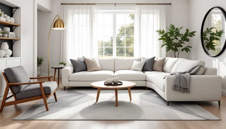
Unlike stark whites or bold accent walls, brown and beige create visual calm without feeling sterile. They ground a space, making it easier to incorporate pattern, texture, or pops of color without the room feeling chaotic. Neutral living rooms leverage this balance to feel both cohesive and layered.
Finally, these tones hold resale value. While trendy colors date quickly, earth tones appeal broadly to potential buyers, a consideration if the home isn’t a forever property.
Choosing the Right Shades of Brown and Beige
Not all browns and beiges play well together. The key is understanding undertones, the subtle hue beneath the surface color.
Warm vs. cool undertones: Beiges with yellow or peach undertones (cream, sand, honey) pair best with warm browns like caramel, cognac, or terracotta. Cooler beiges, those leaning gray or taupe, match walnut, espresso, or chocolate brown. Mixing warm and cool reads as off, not intentional.
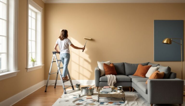
Test paint samples in the actual room. A beige that looks perfect in the store can shift green or pink under your home’s lighting. Paint a 2′ x 2′ section on at least two walls, one that gets natural light and one that doesn’t, and observe it at different times of day.
Consider existing fixed elements. If there’s honey oak trim (warm undertone), choose beiges and browns that echo that warmth. Homes with cooler gray tile or modern black window frames call for greige and deeper browns.
Popular combos that consistently work:
- Linen beige + walnut brown: Clean and contemporary, works in modern spaces.
- Cream + cognac brown: Traditional and cozy, suits transitional or farmhouse styles.
- Greige + charcoal brown: Sophisticated and urban, ideal for modern living rooms.
For walls, lighter beiges open up smaller rooms, while deeper taupes or soft browns add intimacy to large, open-concept spaces. Most paint manufacturers offer beige and brown in LRV (Light Reflectance Value) ratings, aim for 50-70 LRV for main walls to keep spaces bright but grounded.
Furniture Selection for Brown and Beige Living Rooms
Furniture anchors the palette, so choose pieces that add contrast and visual weight without overwhelming the space.
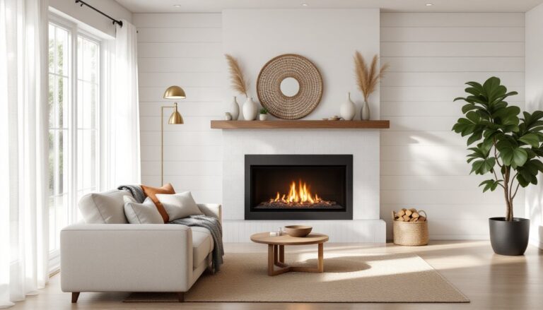
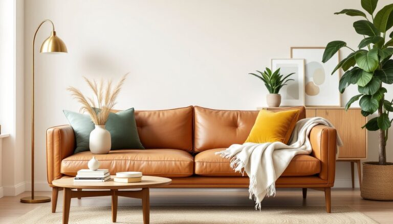
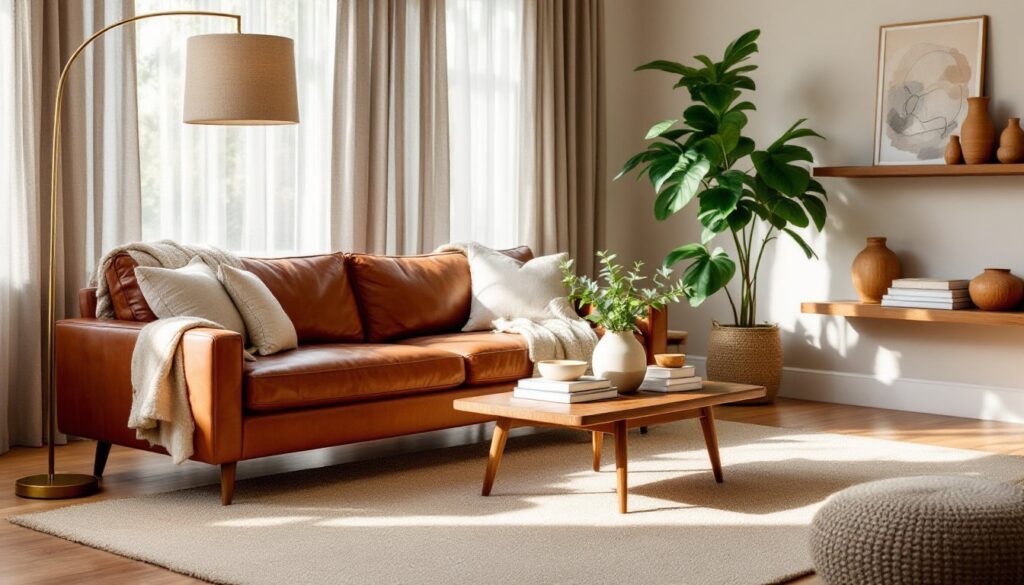
Sofas and seating: A tan or beige upholstered sofa offers flexibility, easy to swap throw pillows and blankets as trends shift. Alternatively, a rich brown leather sofa (full-grain or top-grain, not bonded leather that peels) ages well and develops character. Leather works especially well in homes with pets: it wipes clean and resists pet hair better than most fabrics.
For durability, look for fabrics rated 30,000+ double rubs (Wyzenbeek or Martindale tests). Performance fabrics like Crypton or solution-dyed acrylic handle spills and fading better than standard cotton blends.
Wood furniture finishes: Medium to dark wood tones, walnut, oak, or cherry, ground a brown and beige scheme. Avoid matchy-matchy: mix a walnut coffee table with lighter oak side tables for dimension. If all the wood reads the same tone, the room flattens visually.
Consider scale. Bulky, overstuffed brown furniture can make a room feel heavy. Balance a deep brown sectional with lighter beige accent chairs or a glass-top coffee table to maintain airiness.
Accent chairs: Introduce pattern or a slightly different shade here. A beige linen chair with brown piping, or a camel-colored velvet accent chair, adds subtle variation. Patterns like herringbone, plaid, or geometric prints in brown and cream keep things interesting without clashing.
Metal accents, brushed brass, oil-rubbed bronze, or matte black hardware, on furniture legs or cabinet pulls provide a modern counterpoint to warm tones. These finishes also tie into lighting and decor.
Layering Textures to Add Depth and Interest
Texture is what separates a flat beige-and-brown room from one that feels curated and intentional. Without it, the palette can read as bland.
Textiles: Layer different weaves and fibers. Pair a smooth leather sofa with a chunky knit throw blanket, linen curtains, and a jute or sisal area rug. Velvet or chenille throw pillows add softness against crisp cotton upholstery.
Rugs: A natural fiber rug, jute, seagrass, or sisal, grounds the space and introduces organic texture. These materials are durable (great for high-traffic areas) but can feel scratchy underfoot: layer a softer, smaller rug on top if the seating area needs extra comfort. Wool rugs in neutral patterns (striped, geometric, or subtle Moroccan designs) add warmth without busy color.
Size matters: In most living rooms, an 8′ x 10′ or 9′ x 12′ rug works best, with at least the front legs of all seating on the rug to visually anchor the furniture grouping.
Wood and woven elements: Introduce woven baskets for storage, a rattan accent chair, or wooden shelving with visible grain. Raw or lightly finished wood feels more textured than glossy, painted pieces.
Walls: Skip flat paint in favor of eggshell or satin finishes, which reflect light subtly and add dimension. For more texture, consider:
- Shiplap or board-and-batten painted in a soft beige (DIY-friendly: 1×6 or 1×8 boards installed horizontally with a nail gun).
- Textured wallpaper in grasscloth or linen-look patterns.
- Plaster or Venetian plaster finishes for a high-end, Old World feel (best left to pros).
Mixing matte and slightly reflective surfaces, matte beige walls, a satin-finish wooden coffee table, brushed metal lamps, creates subtle contrast that keeps the eye moving.
Accent Colors That Complement Brown and Beige
Brown and beige form a neutral canvas, but accent colors bring personality and prevent the space from feeling too safe.
Earthy greens: Sage, olive, or forest green echo the natural warmth of brown and beige. Use green in throw pillows, potted plants (fiddle leaf fig, monstera, or snake plants), or a painted accent wall. According to House Beautiful’s exploration of chocolate brown, pairing deep brown with greenery creates a grounded, organic aesthetic.
Warm metallics: Brass, gold, or copper accents add elegance without overpowering. Picture frames, lamp bases, or cabinet hardware in these finishes warm up beige walls and complement brown furniture. Avoid shiny chrome or polished silver, those metals skew too cool for this palette.
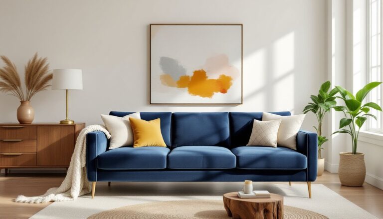
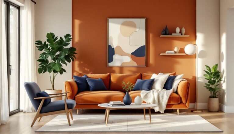
Soft blues: Dusty blue, slate, or navy provide cool contrast against warm browns. A navy throw blanket or blue ceramic vases break up the monochrome without jarring. For a bolder approach, consider modern paint colors in muted blue-gray on a feature wall.
Burnt orange and terracotta: These shades sit within the brown family but add vibrancy. A terracotta pot, rust-colored throw pillows, or an orange abstract print energize the space while staying tonally cohesive.
Black: Use sparingly as grounding punctuation, black window frames, a matte black floor lamp, or charcoal throw pillows. Black sharpens the palette and prevents it from feeling too soft.
How much accent color? Follow the 60-30-10 rule: 60% dominant neutral (beige walls, brown sofa), 30% secondary neutral or texture (wood furniture, neutral rug), and 10% accent color (pillows, art, plants). This keeps the room balanced and prevents accent colors from competing.
Lighting and Decor Tips for a Polished Look
Lighting can make or break a brown and beige living room. Poor lighting turns warm neutrals muddy: the right mix keeps them luminous.
Layered lighting: Combine three types, ambient (overhead), task (reading lamps), and accent (picture lights, uplights). A single overhead fixture isn’t enough. Add floor lamps with linen or burlap shades (echoes the natural palette) and table lamps on side tables for pools of warm light.
Bulb temperature matters: Use 2700K-3000K (warm white) bulbs. Cooler bulbs (4000K+) make beige look gray and brown look dull. LED bulbs in warm white mimic incandescent glow without the energy cost.
Natural light: Maximize it. Swap heavy drapes for sheer linen curtains or woven wood blinds that filter light without blocking it. If privacy isn’t an issue, leave windows bare, natural light enhances warm tones.
Decor elements:
- Artwork: Prints or canvases in the room’s accent colors (greens, blues, metallics) tie the palette together. Large-scale art (30″ x 40″ or bigger) makes a statement without cluttering walls. Homedit offers visual inspiration for pairing art with neutral palettes.
- Mirrors: A large mirror opposite a window bounces light and opens up the space. Choose frames in natural wood, brass, or matte black.
- Plants: Greenery is non-negotiable. Live plants in ceramic or terracotta pots add life and literal oxygen. Low-maintenance options: pothos, ZZ plants, or succulents.
- Books and objects: Style shelves with a mix of books (spines in neutrals or accent colors), wooden bowls, ceramic vases, and a few metallic objects. Avoid overcrowding, leave breathing room.
Styling stylish living rooms often involves editing ruthlessly: remove anything that doesn’t serve a function or add beauty. Brown and beige schemes thrive on restraint.
Conclusion
Brown and beige living rooms aren’t boring, they’re a foundation. The palette’s strength lies in versatility: it adapts to personal style, hides wear, and provides a calm backdrop for the textures, accents, and details that make a space feel lived-in and loved. Focus on mixing tones thoughtfully, layering textures deliberately, and choosing accent colors that reflect personality rather than trends. The result is a room that feels warm, timeless, and entirely your own.