Table of Contents
ToggleBrown and gold is one of those color pairings that just works, warm, sophisticated, and surprisingly versatile. Whether someone’s aiming for cozy traditionalism or modern elegance, these two hues create a living room that feels both grounded and elevated. The trick isn’t just slapping chocolate paint on the walls and calling it a day. It’s about balancing depth with shimmer, texture with tone, and knowing when to layer in contrast. This guide walks through practical ways to pull off a brown and gold living room without tipping into muddy or gaudy territory.
Key Takeaways
- Brown and gold create warmth and visual contrast because brown serves as a neutral backdrop while gold reflects light and adds glamour without overpowering the space.
- Choose complementary brown and gold shades like warm taupe with brushed brass or cognac leather with champagne gold to avoid muddy or dated looks.
- Layer textures through furniture, accent pieces, and decor—combine velvet pillows, natural fiber rugs, and metallic accents—to bring brown and gold living room ideas to life without overwhelming the space.
- Use warm white LED lighting (2700-3000K) and layer multiple light sources at different heights to enhance the shimmer of gold accents and prevent the room from feeling flat or heavy.
- Test paint samples and gold finishes in your actual room for at least 48 hours under both natural and artificial light before making final design commitments.
Why Brown and Gold Work So Well Together
Brown brings earth tones, stable, organic, and reassuring. Gold adds a metallic lift that catches light and injects a touch of glamour without screaming for attention. Together, they create visual warmth while maintaining enough contrast to keep a room from feeling flat.
From a color theory standpoint, brown acts as a neutral backdrop that lets gold accents pop. Gold, whether it’s brushed brass, antique gold leaf, or soft champagne, reflects light in a way that flat brown can’t. This interplay creates dimension, especially in spaces with limited natural light.
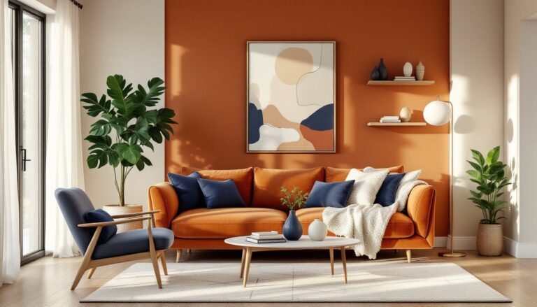
The combination works across design styles. In traditional settings, deep chocolate browns paired with burnished gold trim evoke old-world elegance. For modern living rooms, lighter taupes and matte gold finishes feel sleek and current. It’s a palette that adapts rather than dictates.
Choosing the Right Shades of Brown and Gold
Not all browns and golds play nicely together. A muddy brown paired with brassy gold can look dated fast, while soft caramel with rose gold feels fresh and approachable.
Brown options:
- Espresso or dark walnut: Rich, grounding, works well in larger rooms with ample light. Best for furniture or accent walls.
- Warm taupe or greige: Lighter, versatile, pairs well with both warm and cool metallics. Great for wall paint or upholstery.
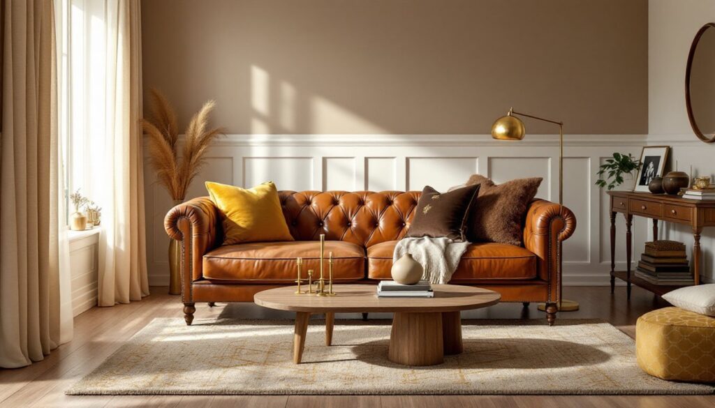
- Cognac or caramel leather: Adds texture and warmth without overwhelming. Ideal for sofas or chairs.
Gold options:
- Brushed brass: Matte finish, less reflective, reads modern. Use on hardware, light fixtures, or picture frames.
- Antique or aged gold: Slightly tarnished look, traditional feel. Works on mirrors, sconces, or decorative objects.
- Champagne or pale gold: Subtle shimmer, less aggressive than bright gold. Good for fabric accents, throw pillows, or curtain rods.
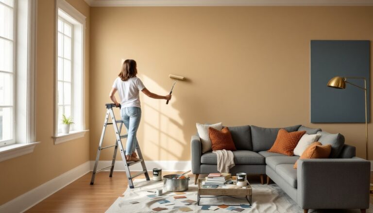
Test samples in the actual room. Natural light shifts color perception throughout the day, and what looks warm at noon might feel muddy at dusk. Paint a 2′ x 2′ sample on the wall and live with it for at least 48 hours before committing.
Furniture Selection for a Brown and Gold Palette
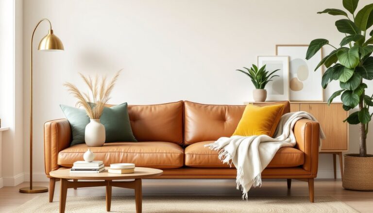
Furniture anchors the palette, so start with pieces that establish the tone. A brown leather sofa or sectional is a classic move, durable, ages well, and provides a solid base for layering gold accents.
For seating, consider a cognac leather Chesterfield or a taupe linen sectional with nailhead trim. Leather develops patina over time, adding character. Linen or velvet upholstery in warm neutrals offers a softer, more relaxed feel.
Wood furniture should complement, not compete. Walnut, oak, or mahogany coffee tables and side tables reinforce the brown tones without adding visual clutter. If the sofa is dark, opt for lighter wood finishes to keep the room from feeling heavy.
Gold hardware and legs on furniture inject just enough metallic without dominating. A console table with brushed brass legs or a media cabinet with gold drawer pulls ties the palette together. Avoid mixing metals in the same piece, stick with one finish per furniture item.
For those working with neutral living rooms already, introducing brown and gold through furniture swaps is a straightforward upgrade that doesn’t require a full remodel.
Accent Pieces and Decor That Elevate the Look
This is where the palette comes alive. Accent pieces should layer in texture, pattern, and metallic hits without cluttering the space.
Throw pillows and blankets:
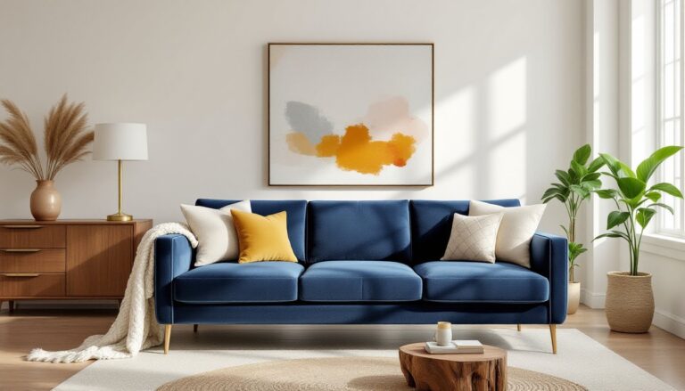
Mix materials, velvet, silk, faux fur, or woven cotton. A gold velvet pillow against a brown sofa adds immediate luxury. Patterns like geometric prints, ikat, or subtle damask in brown and gold keep things interesting. Stick to 3-5 pillows per seating area to avoid the overstyled look.
Rugs:
A patterned area rug ties the color scheme to the floor. Look for rugs with brown base tones and gold geometric or floral motifs. Natural fiber rugs like jute or sisal in warm brown add texture and work especially well in casual or coastal-leaning spaces. Ensure the rug is large enough, front legs of all seating should rest on it.
Artwork and mirrors:
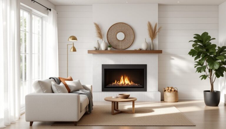
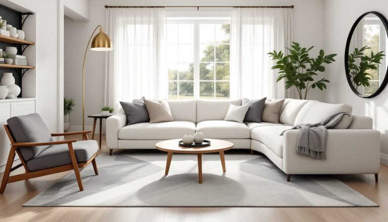
Gold-framed mirrors reflect light and amplify the metallic theme. Hang a 36″ round mirror with a brushed brass frame above the sofa or mantel. For artwork, consider abstract pieces that incorporate both colors, or stick with black-and-white photography in gold frames for contrast.
According to design experts at Homedit, layering metallics with natural textures prevents a room from feeling too staged.
Decorative objects:
Gold candle holders, brown ceramic vases, or brass bookends add finishing touches. Group objects in odd numbers, three candlesticks on a side table or five stacked books topped with a small gold sculpture. This creates visual rhythm without symmetry overload.
Wall Treatments and Paint Colors
Walls set the stage, and the right paint or treatment can make or break the palette. For a cohesive look, walls should complement the furniture and accents rather than compete.
Paint options:
- Warm taupe (e.g., Sherwin-Williams Accessible Beige, Benjamin Moore Revere Pewter): Versatile, pairs with both dark and light browns, doesn’t read too gray or too beige.
- Soft cream or ivory: Keeps the room light, lets gold accents stand out. Works well in smaller spaces or rooms with limited natural light.
- Deep brown accent wall: Adds drama without closing in the space. Use on the wall behind the sofa or fireplace. Balance with lighter walls on the remaining three sides.
Paint coverage averages 350-400 square feet per gallon for quality interior latex paint. Always prime if transitioning from a darker color or covering stains.
Wallpaper and texture:
Textured wallpaper in brown and gold patterns, damask, trellis, or subtle stripes, adds depth. Install on one accent wall to avoid overwhelming the room. Peel-and-stick options simplify the process for renters or commitment-phobes.
For more guidance on selecting hues that complement brown and gold, explore options for living room paint colors that align with this warm palette.
Wainscoting or board-and-batten:
Painted in a soft cream or taupe, these add architectural interest and a traditional touch. Pair with a darker brown paint above the chair rail for a classic two-tone look.
Designers at House Beautiful recommend testing multiple paint samples in both natural and artificial light before finalizing the choice.
Lighting Strategies to Enhance Gold Accents
Lighting is critical in a brown and gold living room. Done right, it amplifies the warmth and shimmer. Done wrong, the room feels dim and heavy.
Overhead lighting:
A chandelier or pendant with brass or gold finish serves as both light source and focal point. Look for fixtures with exposed bulbs or glass shades to maximize light output. Dimmer switches allow flexibility, bright for tasks, softer for ambiance.
Task and accent lighting:
Table lamps with gold bases or bronze finishes provide layered lighting. Place one on each end table flanking the sofa. Shades in cream, linen, or soft gold filter light warmly. Adjustable floor lamps with brass arms work well in reading corners.
Recessed lighting:
If the room already has recessed cans, swap standard bulbs for warm white LEDs (2700-3000K) to enhance the brown and gold tones. Cool white (4000K+) will make the palette look washed out.
Wall sconces:
Flank a mirror or artwork with gold or brass sconces to highlight those pieces and add vertical light. This draws the eye up and makes ceilings feel higher.
Natural light:
Maximize daylight with sheer curtains in cream or champagne. Heavy drapes in brown velvet or linen add drama and can be drawn for privacy. Mount curtain rods 4-6 inches above the window frame and extend them 3-4 inches beyond each side to create the illusion of larger windows.
Interior stylists at Home Bunch emphasize that layering multiple light sources at different heights prevents a flat, one-dimensional feel.
Conclusion
Brown and gold deliver warmth and sophistication without requiring a design degree to pull off. The key is balance, layer textures, vary shades, and let metallics catch light without overwhelming. Whether refreshing a single wall or overhauling the entire space, this palette adapts to both traditional and modern sensibilities. Start with one anchor piece, build around it, and don’t be afraid to test samples before committing.